 In studio ·
In studio ·
In studio ·
Product design · Motion · 2024
A product design system for an app that organises the everyday into something calmer. Spatial, considered, and quiet — motion used not for spectacle, but to make the interface feel inhabitable.
About the project
App Space began with a simple observation: most productivity apps are louder than the work they’re meant to support. Too many surfaces, too many affordances, and not enough quiet between them.
My brief was to design a product system built on negative space — to make the empty areas carry as much weight as the filled ones, and to let motion do the work of hierarchy so the interface didn’t need to shout.
The result: a product language that feels spatial rather than layered. Transitions that behave like rooms, not pop-ups. A colour system that earns attention only when it has something important to say.
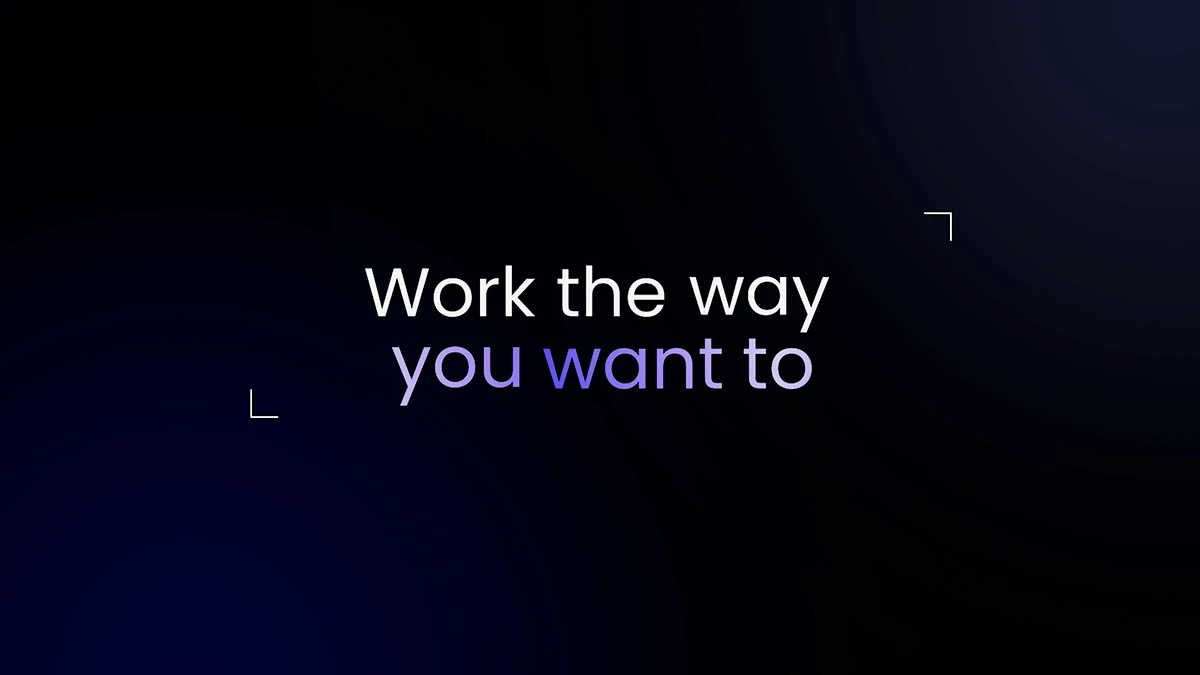
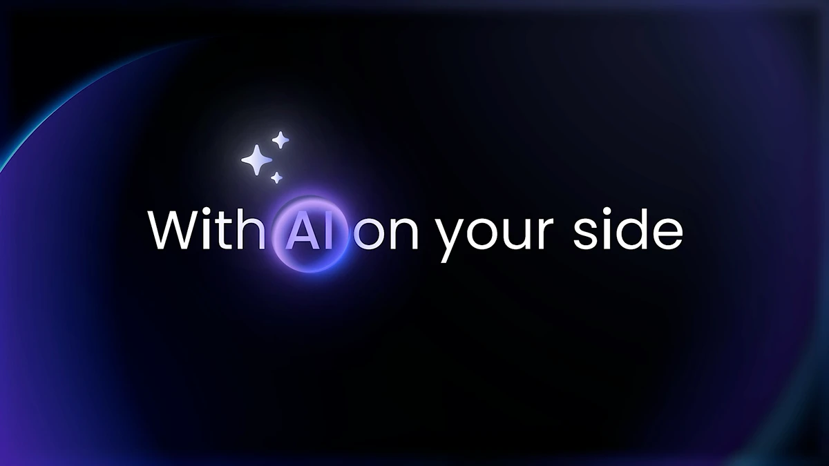
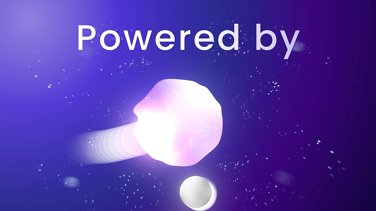
Motion studies
Interface




Process
The first month of the project was almost entirely about the grid, the spacing scale, and the motion curves. No colour, no icons, no polish. I wanted the bones to be right before I dressed anything.
Once the foundation was solid, the visual design came together quickly. The restraint I built in at the structural level meant that every surface decision — a typographic weight, an icon set, a colour accent — could be made confidently, because there was a clear system telling me when to hold back.
Final delivery: design tokens, an animated component library, a motion principles document, and a set of key screens handed off to the engineering team in a single Figma file.
Next project