 In studio ·
In studio ·
In studio ·
Web design · Motion · 2025
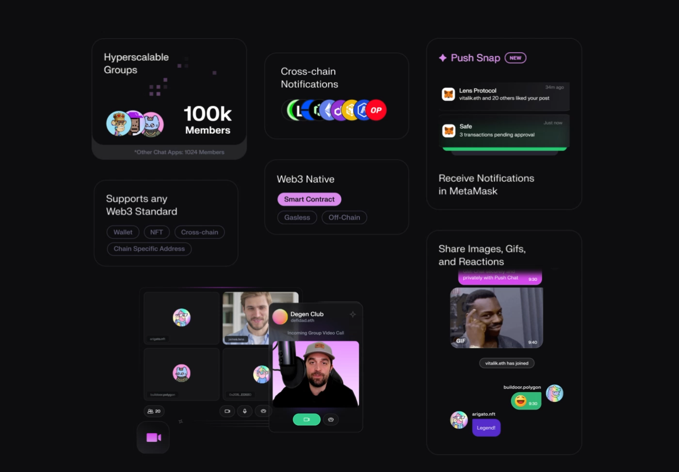
The companion website for Push Point — a tight, six-screen walk through the brand that lets the motion system do the heavy lifting. No hero carousels. No scroll-jacking. Just the product, moving.
About the project
The identity set the tone. The website just had to keep up. I built six principal screens, each designed to earn its own scroll position — no fluff sections, no stock animations, no third-party chrome pretending to be a product.
Every transition was animated against the same motion grid as the brand system, so the site feels like a continuation of the product rather than a marketing layer bolted on afterwards.
Deliverables: design system tokens, six animated screens, Lottie files, a handoff document the engineering team didn’t send back with questions.
The walkthrough
Key moments

Next project